sUP
The world's first superpowers e-store

Project overview
During an interview I was asked to do this exercise.
My Role:
Research
User persona
User journey
Wireframing
UI design
Software used:
Miro
Adobe XD
Illustrator
Photoshop
The Challenge
The world's first superpower store is going to be developed. The users should be able to buy the superpower they prefer being able to add and remove the features associated with the chosen superpower. Each superpower has a detailed description indicating the main aspects, merits and defects of the product.
THE TASK
Design the checkout userflow or wireframe from the homepage.
Design the UI Product page
Project Brand Identity ( logo, font e colors)
Presentation
Personas
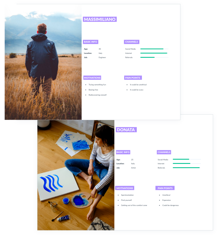
Before starting to think about the product I devoted a part to research and I conducted 10 interviews.
Based on the interviews I set up two personas. We referred to them throughout the entire product development process.
Despite the fact that the people were very different from each other, they presented all the same motivation but different pain points. I got really interesting insights such as:
People want to try always something fun
They wanted to experiment and being more free
They wanted to be more in contact with themselves and their body
They are scared of how their body is going to respond if they're gonna decide to get a superpower
They are scared it could be unethical maybe to be more powerful than another human being
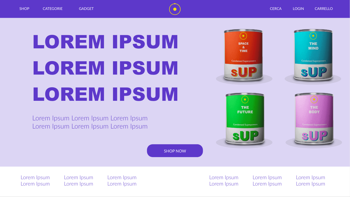
This interviews affected my design and my idea on how to shape the core of the product, hence my decision to divide superpowers into four major categories: body, mind, future and space/time.
This interviews affected my design and my idea on how to shape the core of the product, hence my decision to divide superpowers into four major categories: body, mind, future and space/time.
User Journey
I mapped out the users’ steps to see how I could simplify their journey to help them reach their most important goal with the product.
I think the most important goal of a user is to buy a superpower so I focused the user journey in that direction, I also try to create a journey not to complicated and very user friendly not to upset at one point the user.
The user journey also helped me to have more clear vision in the next step of the design.
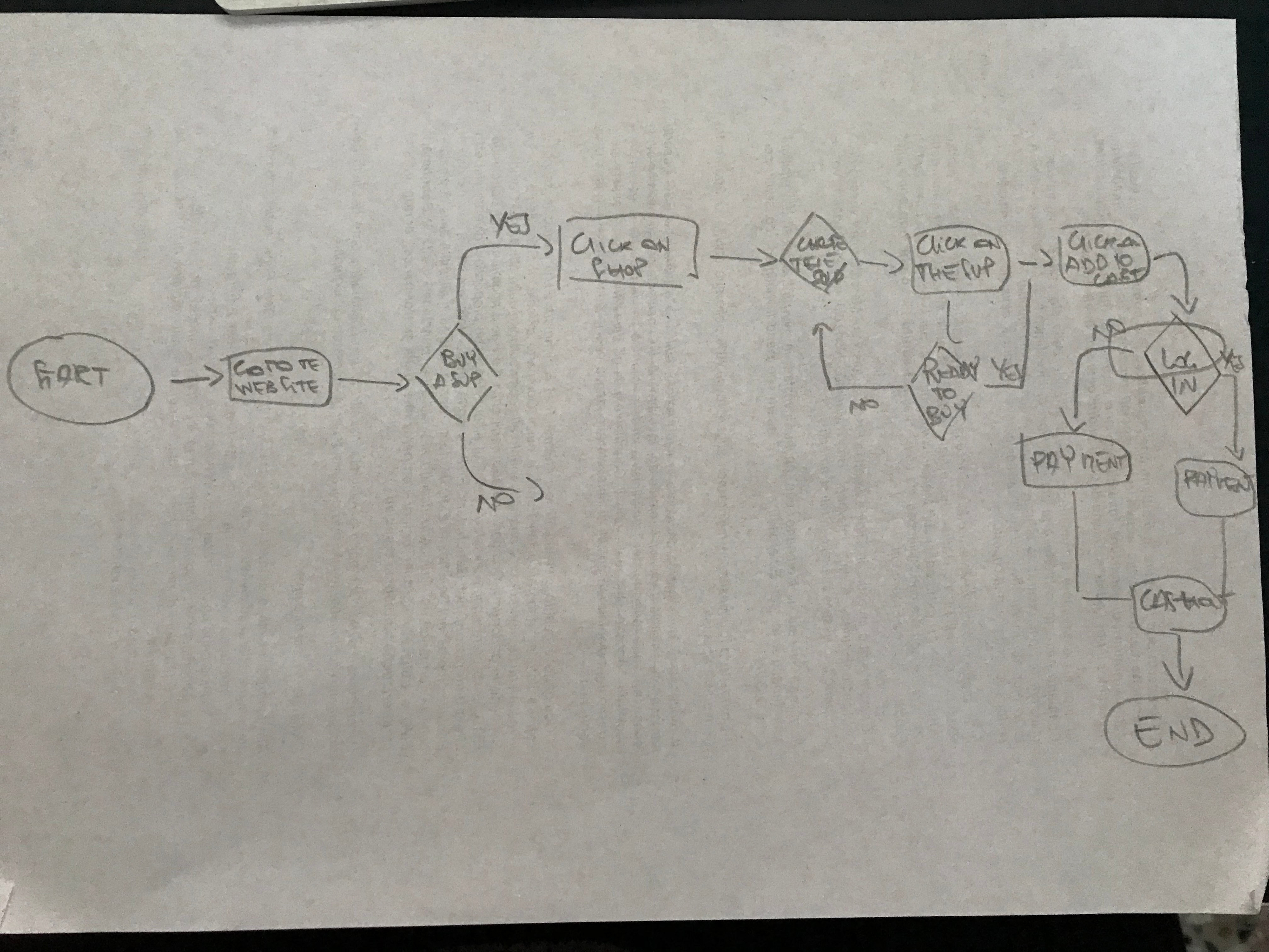

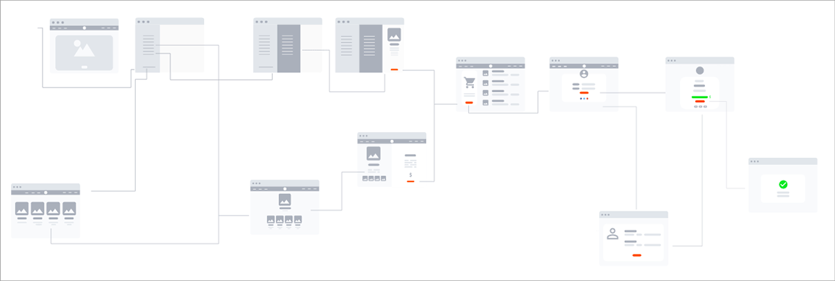
Wireframes
After creating the user journey I designed a Lo-FI wireframe flow, first I create a pencil sketch and then I use Adobe XD.
The flow is simple:
1)The user arriving on the home page of the site is faced with several possibilities for choosing their products and then purchasing them. One way is to click on "SHOP" at the top left of the header.
2)A scrolling menu will open, from left to right, until it occupies a third of the screen. The image of the home page will become blurry. The menu will indicate the categories into which the superpowers are divided (space/time, the human body, the future, the mind). If the user passes over one of these categories with the mouse, there will be a hover effect, which will open another menu, with the products of each category. If the user clicks on a category, he will be redirected to the respective page of the chosen one. If the user clicks on the bottom of the list "View all products" they will be redirected to the Categories page.
3)At this point the user has a list of all the products in front of them. If you move the mouse over one of the products again, another scrolling menu will open in the last part of the screen where there is a picture of the product with the inherent features that can be removed or added, including gadgets. At the bottom you can find the add to cart button.
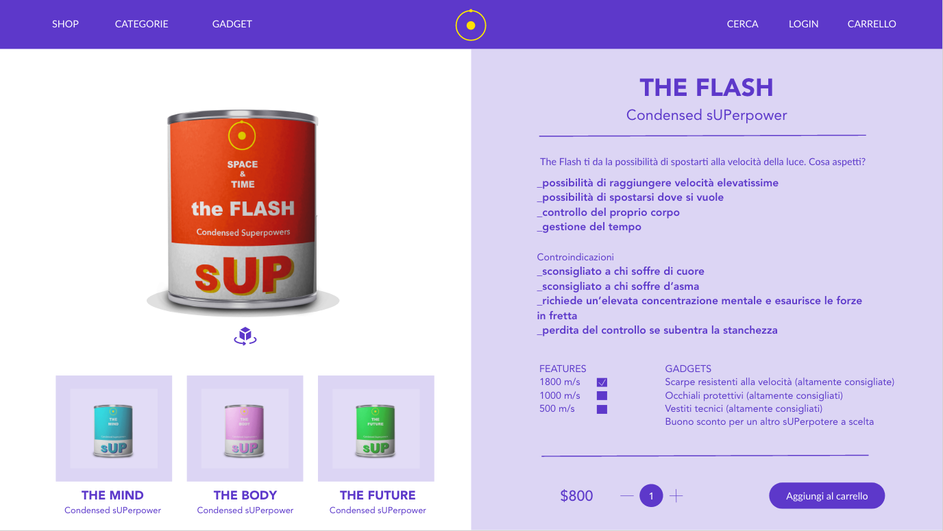
4)Clicking on a specific product will take you to the product page, with the screen divided in two, on the right the photos of the product and on the left the description, with the possibility of adding and removing the various features and gadgets that will automatically be suggested according to the superpower you have chosen. At the bottom, after the price and quantity, you will find the Add to cart button.
5)Clicking on Add to basket will open a new page where the user can find the items in the basket (which he can still remove or add in quantity) and the Checkout button at the bottom.
6)By clicking on Checkout the user will be redirected to the log in screen. By entering his credentials (user and password) he will be redirected through his account directly to the payment page. If you are not registered, you will be redirected to a page where you will have to fill in a form with your registration data in order to access the payment page.
7)At this point the user will be able to make the payment in the most appropriate method for them (they will have a choice between credit card, Facebook Pay, Google Pay, cryptocurrency). After pressing the button to make the payment there will be a redirect to the site for payment, after which there will be another redirect to e-commerce where the transaction page will appear correctly.
UI Design
I decided to take inspiration for the style from comic books and recent marvel movies. I wanted the style to be fresh but also to have vibrant colors, something that the user will remember and can capture their attention. this is a concept for a website, so I designed everything for desktop.
LOGO DESIGN
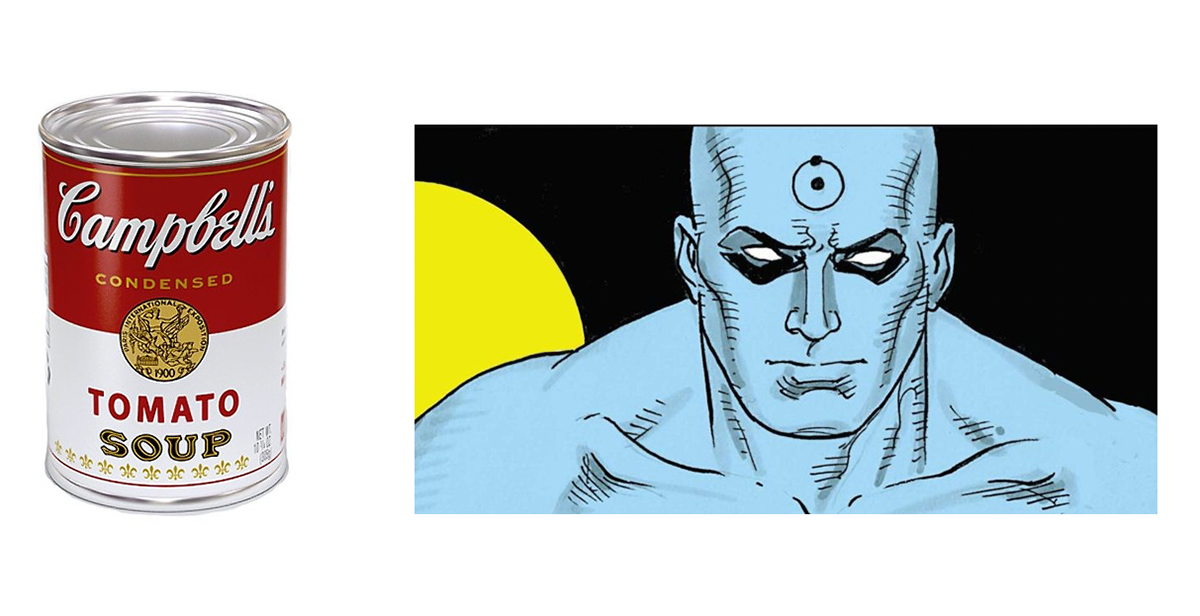
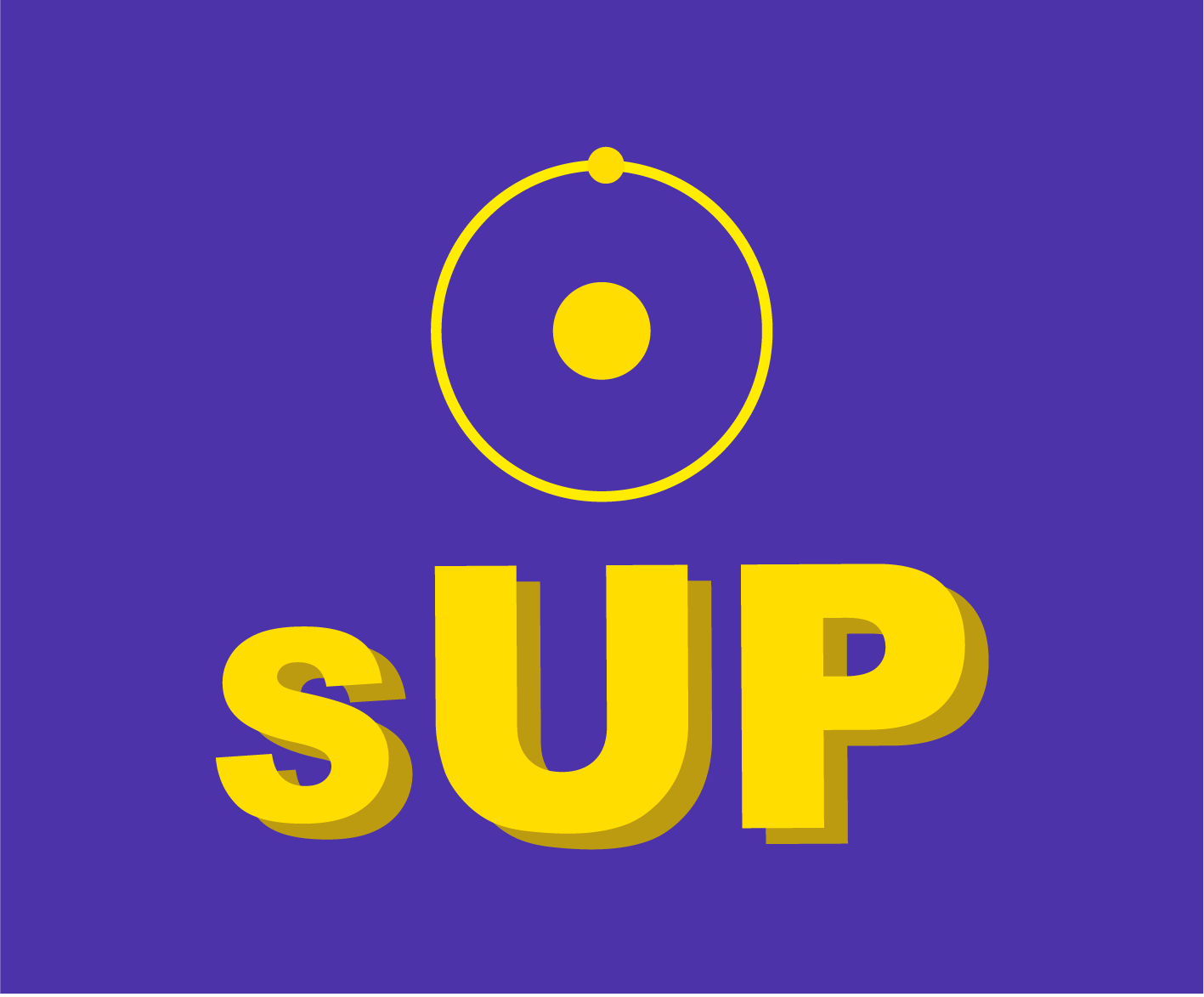
Thinking that superpowers could be acquired by being ingested as food, I used Campbell's Soup as a reference. I revisited the famous tin, keeping the colours of the label but making some changes. Initially the tin was supposed to be the logo, containing also the sUP logotype, but I realised that it could be redundant, considering that it was also the product. I decided to add the hydrogen atom symbol, taking my cue from Dr Manhattan, a character from the graphic novel 'Watchmen'. Dr Manhattan is a man who has been genetically modified by a nuclear accident and has become indestructible. The hydrogen atom is what he has on his forehead and the symbol that distinguishes him. The symbol is very simple and recognisable, even without knowing either that it is an atom or that it refers to the comic strip, it comes in all colours and is perfect for becoming the logo.
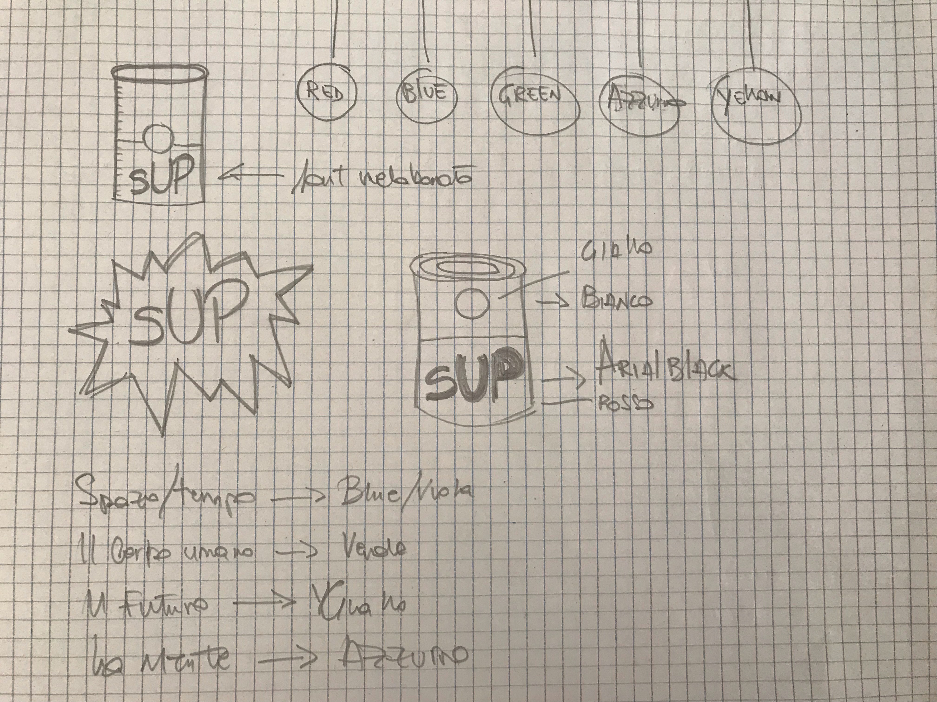
I chose yellow because it is a prominent color, it reminds of light but also of energy and knowledge.
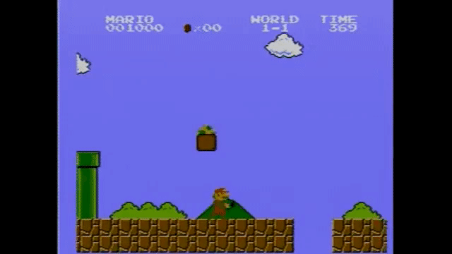
As for the sUP logotype, it's short for superpowers but it reads like SOUP. The "S" is lower case because it leaves room for the "UP", which remains in capital letters, signifying the energy charge that you will receive, another pop reference from Super Mario bros. This is also in yellow, for aesthetic consistency, but can be declined in other colors as well. I used an Arial Black font which I expanded and modified slightly, adding the same text in the background but in a darker colour so as to create a three dimensional shadow effect.

Conclusions
In my work process I have tried to take into account all the necessary elements to be able to carry out the challenge in the best possible way and to develop a potential user-friendly e - commerce. I believe that the most important thing besides this for the sale of a product of this magnitude is the question of ethics, which would open up endless discussions. For this reason, in my opinion, the most precise and detailed descriptions possible of the product are very important, but also the features and indications on the gadgets and, above all, the contraindications.
"With great power comes great responsibility"
Peter Parker
Peter Parker