Sicilia Mia Website
Sicilia Mia is a start-up that aims to offer people tailor-made stays in luxury villas through its booking platform. Furthermore, its goal is to boost part of local tourism by offering a unique and ecofriendly experience.
PROJECT OVERVIEW
I worked on this project while working for the Sicilia Mia startup.
Duration: 3 months
Duration: 3 months
My role:
Desk research
Comparative analysis and benchmarking
Interviews
Customer journey
User flow
Wireframing
UI
the problem
SiciliaMia is an international startup based in Italy whose goal is to build a booking platform for luxury villa stays in Sicily, offering unique and tailored experiences and trying to boost local tourism.
How might we help people book the best vacation in the best possible way by offering the best local experience?
How might we help people book the best vacation in the best possible way by offering the best local experience?
The platform is still under development.

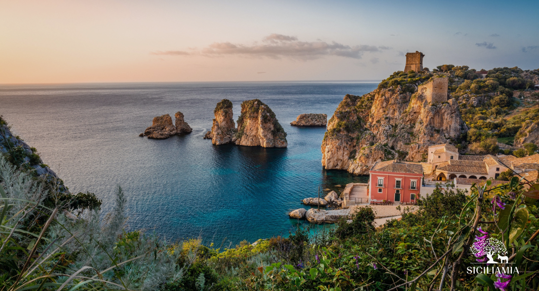
current SiciliaMia landing page www.siciliamia.com
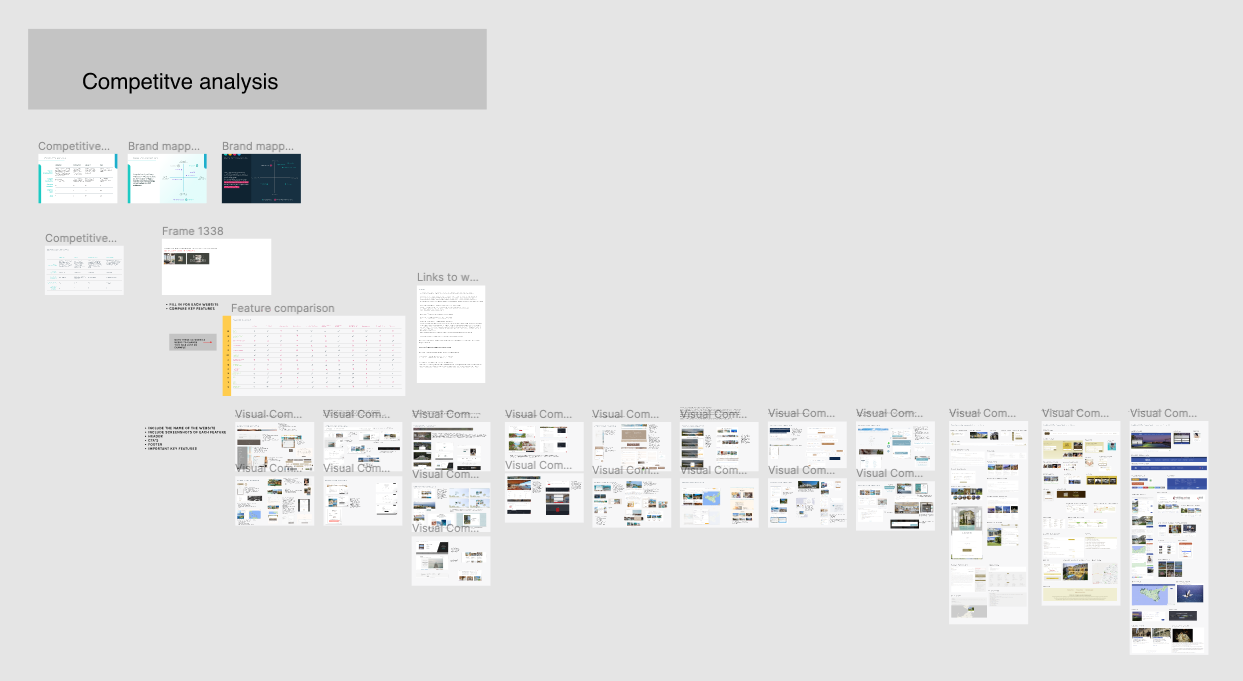
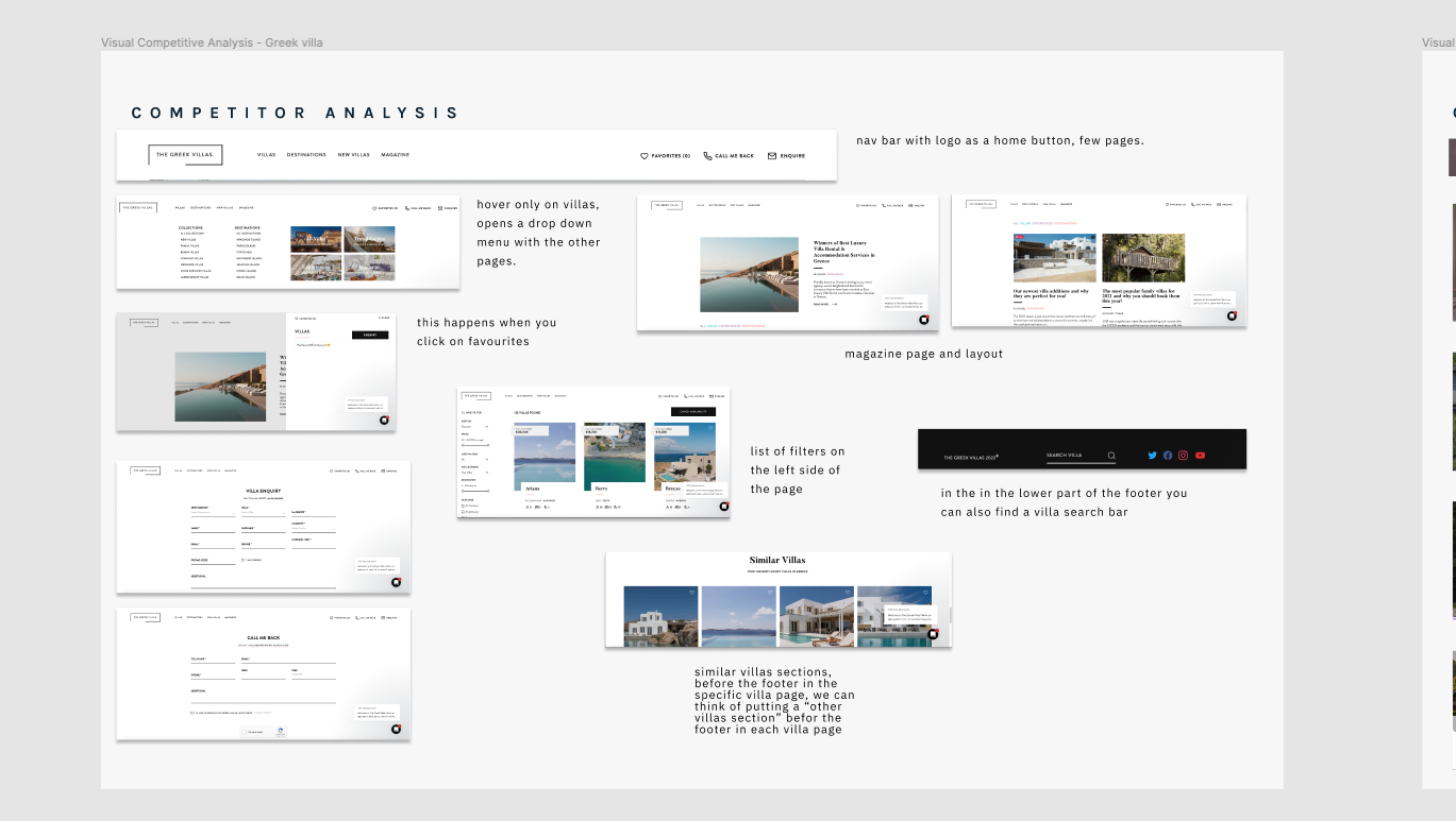
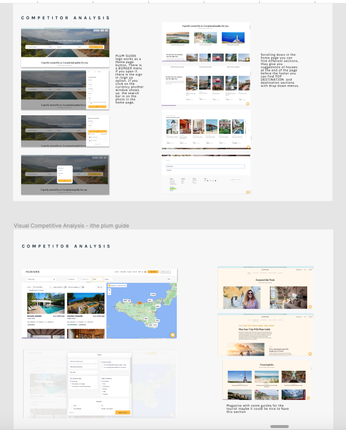
Desk research, COMPARATIVE ANALYSIS AND BENCHMARKING
This part was very important and defined the next steps. Initially the search was to look for platforms that had a similar purpose to ours, like air bn b luxury. then I decided to look for more specific, niche things that reflected what we wanted to convey, the keywords were luxury and eco friendly. So I evaluated and analysed according to heuristics sites such as The plum guide, La Cure or the Greek Villas that best suited us. In this part, I understood not only the parts from which to draw some sort of inspiration but above all what NOT to do.

INTERVIEWS
I conducted a number of interviews and created a survey to determine parameters and define a user persona. These interviews revealed that:
-Most people are stressed if they have to choose between too many things and if they have to take too many steps to book
-Most people do not want an all-inclusive stay but prefer to be free to choose what to do on the spot as well
-People appreciate having local experiences
-The eco-friendly issue is definitely a plus
-The average target group that can afford such a holiday is 35-60 years old
-It can also be a family holiday, but families need to have a really good income
-It can also be a family holiday, but families need to have a really good income

USER (customer) JOURNEY
With the data collected so far, I was able to create a user journey. This allowed me to define the user persona and the target audience even more precisely and to understand the user behaviour during the different touchpoints.

USER FLOW
Before wireframing I also designed the user flow, starting with the user booking the villa to register cash out.

wireframes
My task was to design the villas page and then to design a proposal for the home page. My type of design was also conditioned by the fact that there were already guidelines and proposals as the team had been working on the product for some time. The idea was to give a clear, clean and elegant layout with the strictly necessary elements. I first created lo-fi wireframes to define the structure of the page and then moved on to hi-fi.
design for the Villas page

specific villa page design
my design for the home page
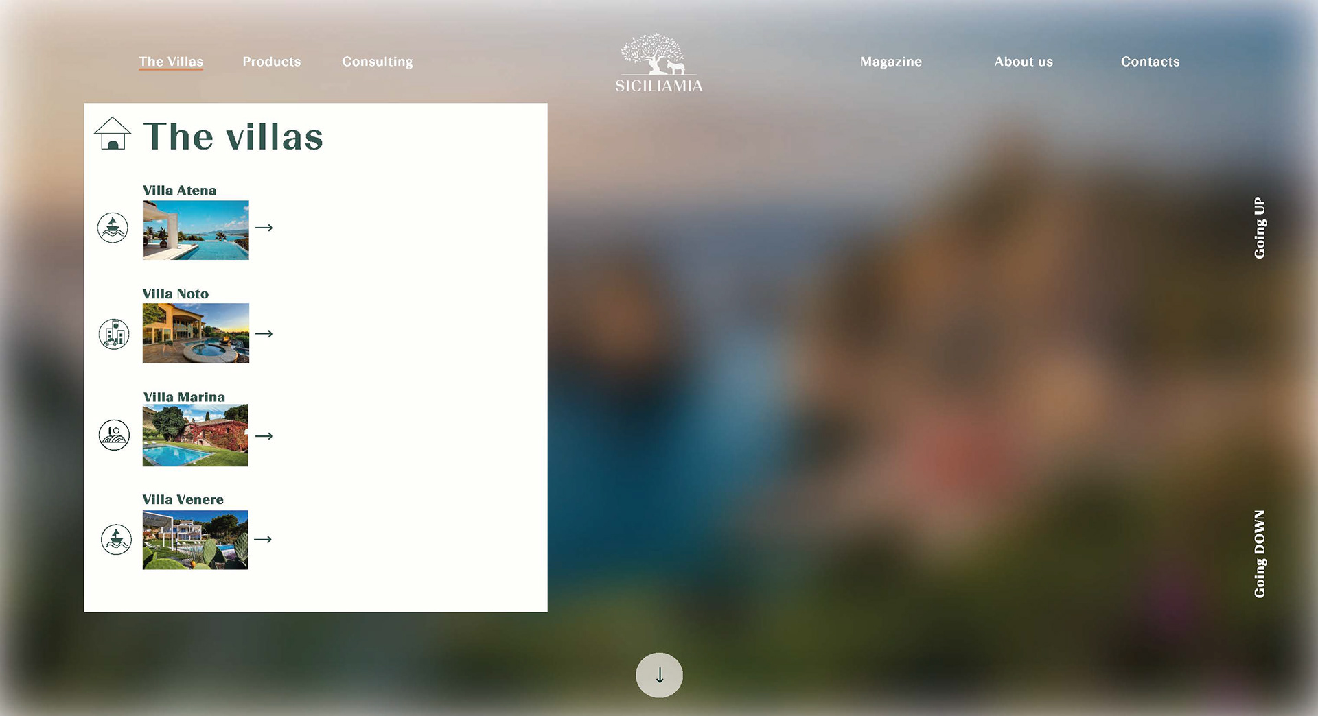
my design for the home page villa menu
The lack of design consistency between the two pages is due to the fact that on the villa page some things had already been approved such as the menu and the footer while on the home page only the layout had been approved but I was able to experiment more. I designed the icons in the menu and the illustrations in the background and the icons in the services sections and changed both the menu and the footer, making it lighter and with fewer elements. I also chose orange as the colour as this was also already part of the logo and the previously accepted style guide.
conclusions
What I learnt during this experience is mainly related to research and teamwork. A good collection of data lays the foundation for good work later on, but the work is long and especially iterative so unfortunately my time was limited to be able to work more specifically. Also as far as design is concerned, if I had more time I would have liked to take the design of the home page further and create a prototype.