La PedagogistaStrategica Website
Silvia Poletti is a pedagogist and psychologist with 20 years' experience specialized in helping parents who need the right educational strategy for their children.
PROJECT OVERVIEW
I worked on this project in collaboration with the web agency Web Management.
My role:
Logo Design
UI
Wireframing
Prototyping
Illustrations
The Challenge
The client wanted a site that would highlight the work she did but above all allow her to convert, i.e. to be able to have a platform that would allow her to sell her expertise online.
Logo design
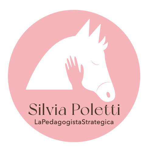
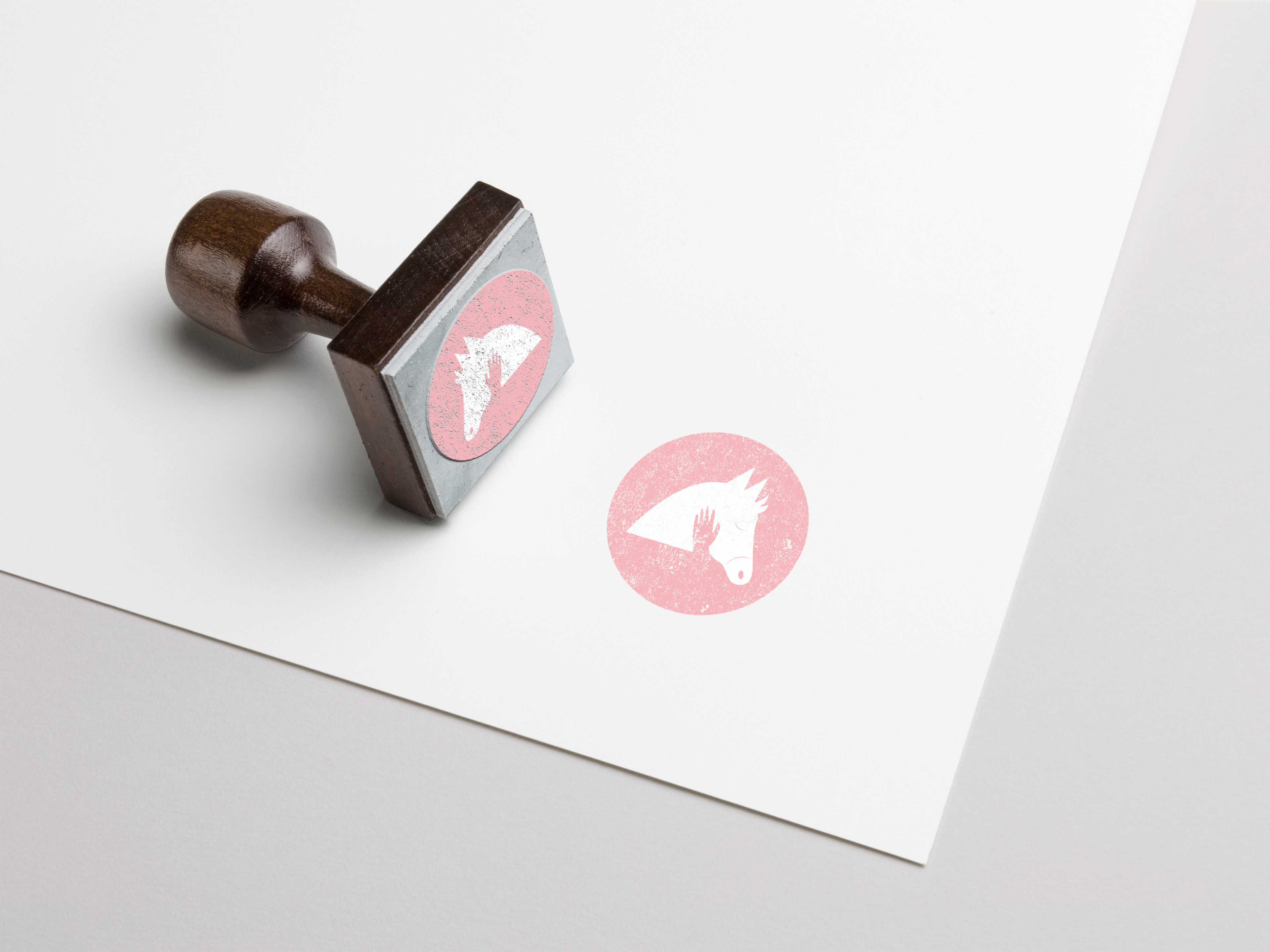
The customer wanted a logo to represent her technique. The logo depicts a small horse being tamed, a metaphor with which the psychologist refers to the more rebellious children, whom she calls "cavallini purosangue" ('thoroughbred horses').
The colour chosen is pink in a pastel shade because it is a color that represents her and inspires tranquillity.
The colour chosen is pink in a pastel shade because it is a color that represents her and inspires tranquillity.

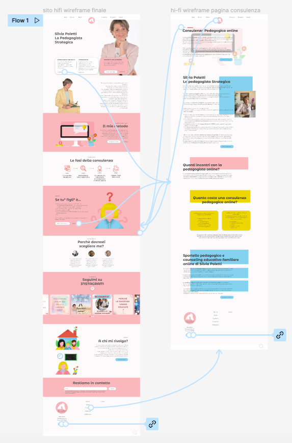
Wireframing
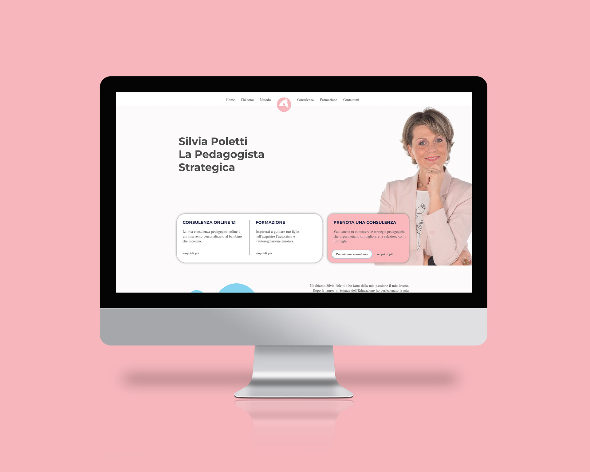
As I said before the client wanted a website that would highlight the work she did but above all allow her to convert, i.e. to be able to have a platform that would allow her to sell her expertise online.
Therefore, it was very important that the user once landed on the page immediately had the possibility to book a consultation. That is why when I was designing the layout I decided to make a call to action immediately visible.


While designing the wireframes I tested this solution with Maze with a small group of people (to be able to optimize time) and it proved to be 100% successful.

UI
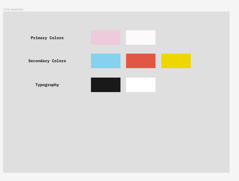
The first thing I did to start creating a design system was to create a moodboard, after analysing competitors and benchmarking. This way I decided on colours and different fonts.
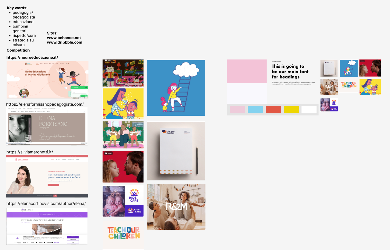

As the primary colours I chose pink, which is already present in the logo and white, alternating with the secondary colours blue and yellow and red tending towards orange present in the interactions and illustrations. All shades are in pastel tones so as to recall the world of children.

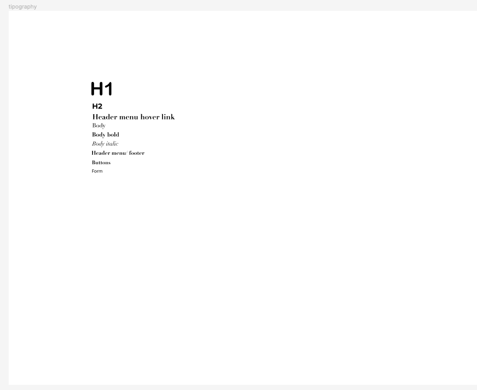
As typography I decided on 3 different fonts: Arial Rounded MT for H1 and H2 and Didot for body text, buttons, menu and footer. I wanted to mix something elegant like Didot with something more playful like Arial rounded.
The third font used is Noto Sans and is only for input fields.
The third font used is Noto Sans and is only for input fields.
I designed the CTA buttons inspired by the material design guidelines.
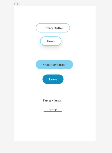
There are three types of buttons: primary, white with a light blue outline which while hovering on it creates a light shadow in the background; secondary, light blue without an outline which while hovering becomes darker blue; the third type of button has no background or outline and while hovering on it the user will see an orange-red line appear.
ILLUSTRATIONS
Drawing the illustrations was a very pleasant part. There were to be 3 illustrations on the one page and then they would be used as an illustration system on the other pages of the site. I wanted the illustrations to represent the text they accompanied but at the same time be consistent with the style of the site and the message the client wanted to convey.
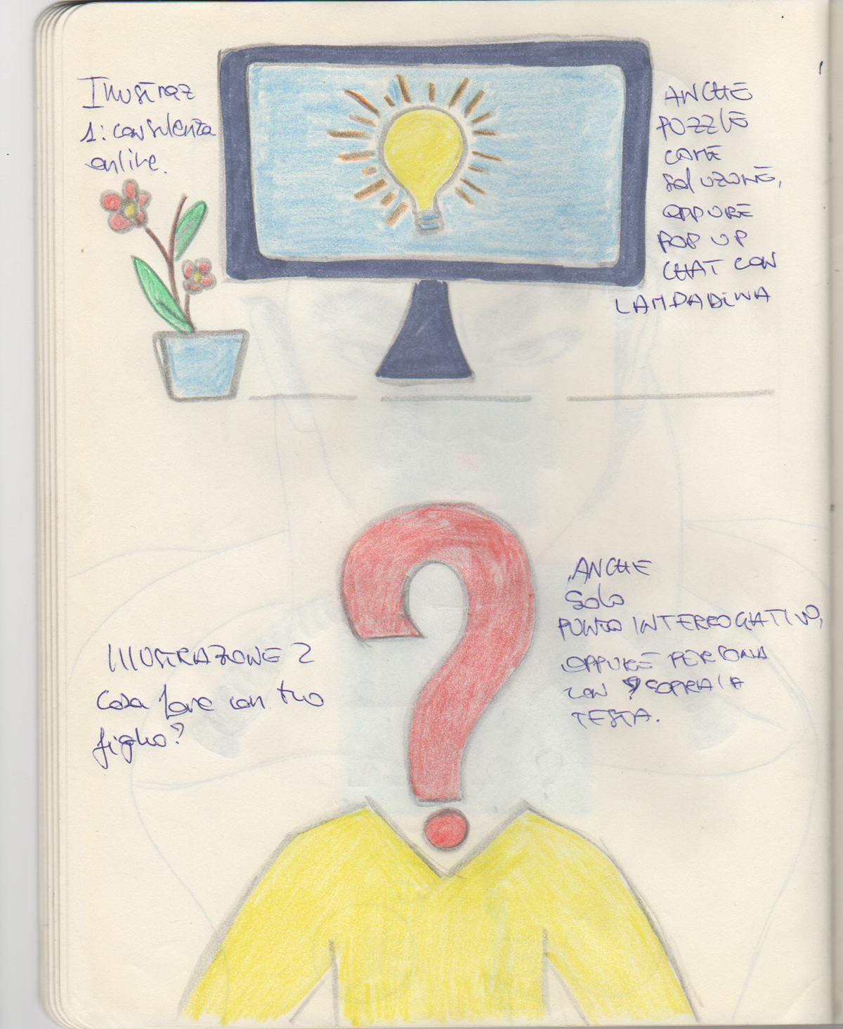
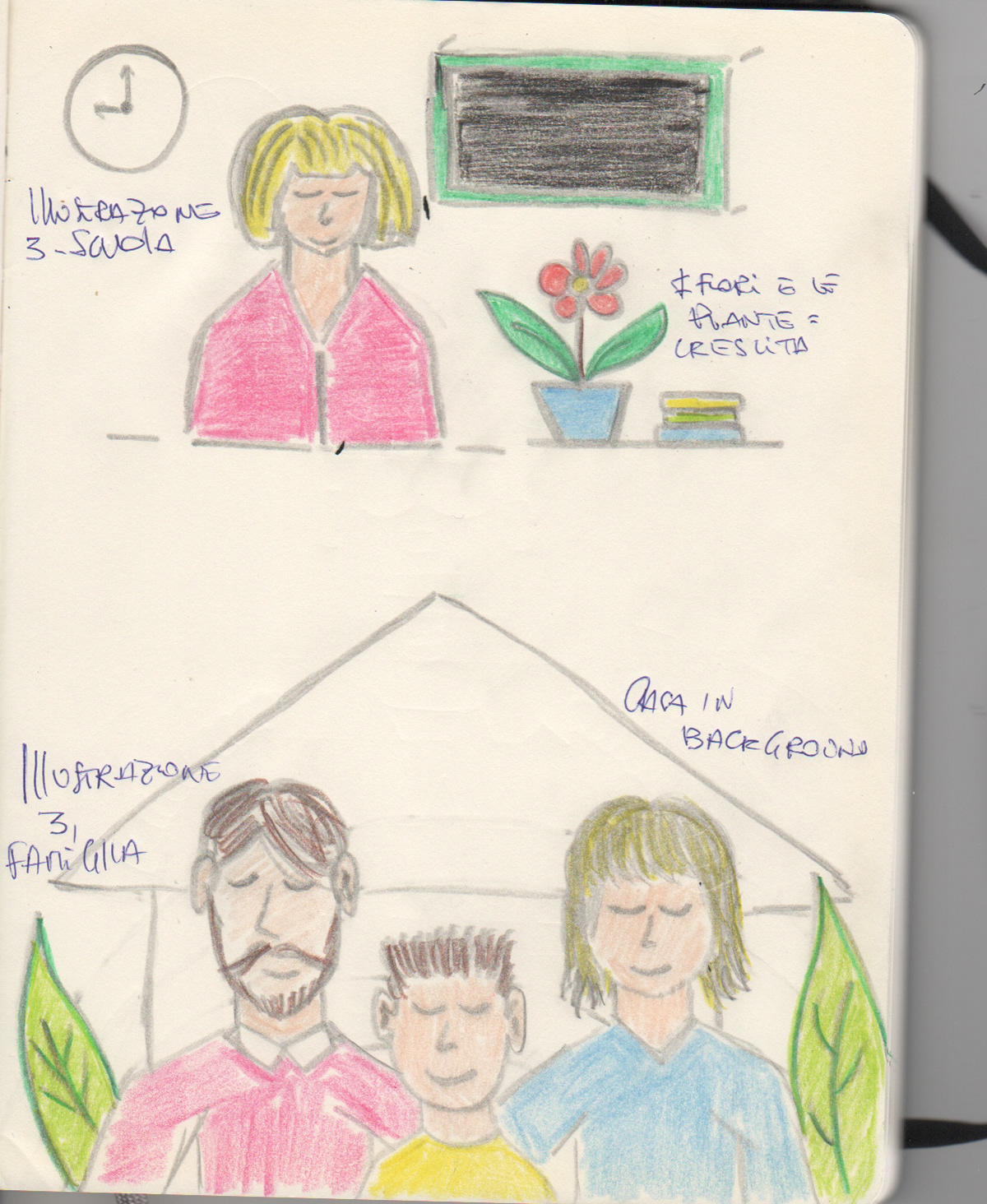
Illustrations pencil sketch


PROTOTYPING
I also create a prototype to show the client the home page and one other page (in this case the "counselling" page).
I also create a prototype in Figma for the Instagram Carousel. It was very important for the client this part because most of her work and her audience came form IG and is related to the social so she wanted a part in the home page with the preview of he account photos.


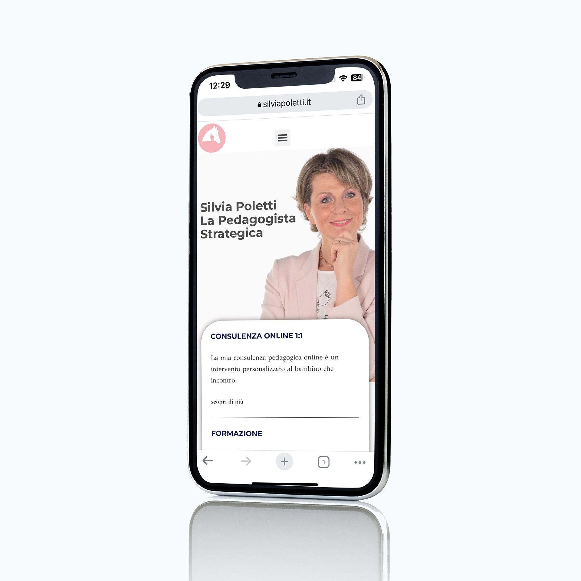
The website is online and you can find it here at this link: https://silviapoletti.it/
Thanks for watching!! 👀
Have a nice day! 🌈
Have a nice day! 🌈