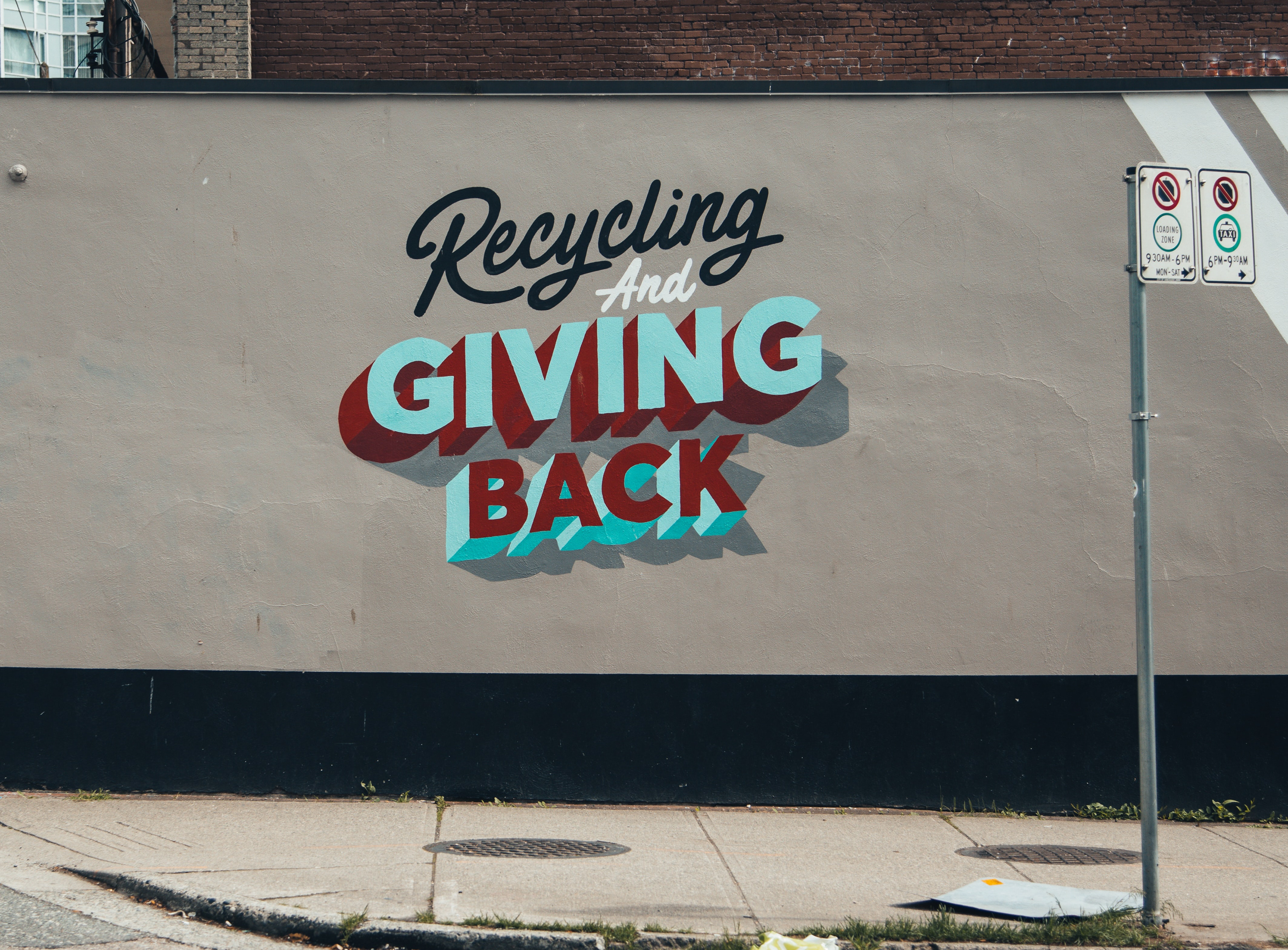
Give IT
An app created to help people recycle old clothes and support non profit organization in their efforts to make a difference.
Project overview
This project was developed during a master bootcamp @ Nuclio Digital School.
My Role:
Product strategy
Desk research
User persona
User journey
Wireframing
Prototyping
UI design (Illustration and icons)
Usability testing
Software used:
Miro
Figma
Illustrator
The Challenge
The fashion industry is one of the most polluting industry in the world. It is estimated that only 30% of what it produces is used annually, 70% becomes waste. Globally less than 1% of clothes are recycled as clothing, partly due to inadequate technology.
Fast fashion has imposed itself in everyone's life, it replaced the concept of buy less but better and it comes at an environmental cost.
People have many clothes that don't use and that take up space, that they would like to donate but often it is not clear how to do so, they might not have any recycle bin near their houses or might not always have the time to take the items there. .
How might we help people to get rid of their clothes without creating waste and also helping people in need?
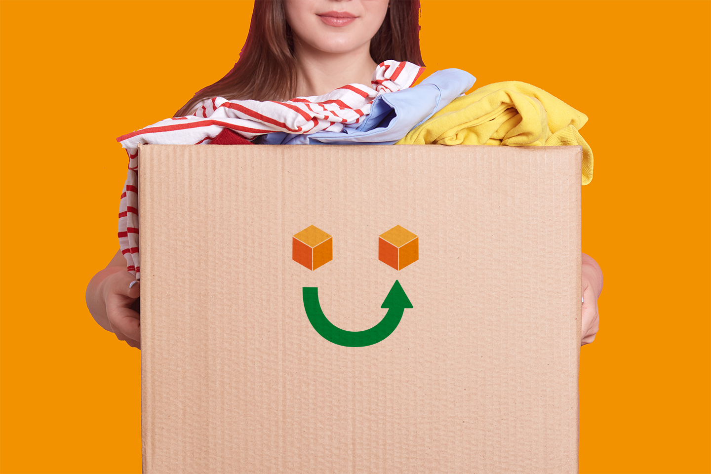
GiveIT is a native android app, currently for the Italian market, designed not only to help people recycling unwanted clothes without having to leave the house, but also conceived for have a positive impact on the environment.
DISCOVERY PHASE
Interviews
We started by conductive qualitatite research to get a better understanding of the subject matter. We wanted to know people's habits around recycling and donating and we wanted to go in depth to get relevant insights.
There were two rounds of interviews one with general questions and later in the discovery phase with more specifics ones based on the previous results.
There were two rounds of interviews one with general questions and later in the discovery phase with more specifics ones based on the previous results.
The most interesting insights that emerged were:
Most of people don't donate because they don't have the time to take the clothes to the charity associations;
They don't have a recycle bin for clothes nearby;
They don't know how the donating process works, the journey is not clear;
They had some unfortunate experience with donating previously;
They want to know to whom the clothes they donated will go and whether they were useful;
They want to know what associations needs exactly so they don't donate something that they'll probably throw away later.

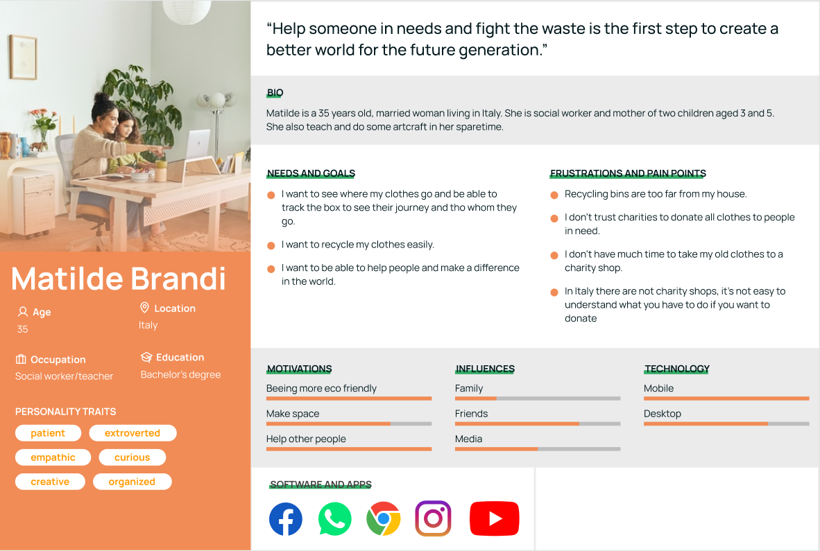
Personas
When we completed the second round of interviews we decided to create a user persona profile based on the data we recollected. We wanted to outline accurately and realistically the pain points emerged from the interviews.
We referred to the profile throughout the entire product development process.
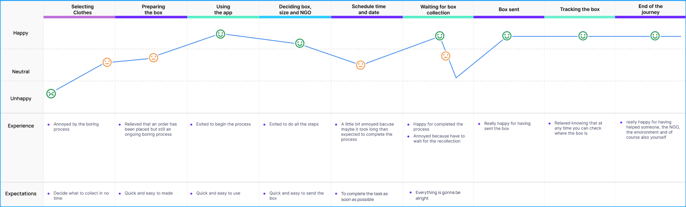
User Journey
I mapped out the users’ steps to see how I could simplify their journey to help them reach their most important goals with the product. Using this method of visualizing the entire end-to-end user experience I was able to understand some important steps prior to designing our app. First of all, I was able to define the user feelings during all the steps and this would have helped us later with the design.
The user journey was a very important phase to determine which were the most important things to focus on and which were the least important based on the user's emotions.
WIREFRAMING
Sketches
I usually start the design process with sketching on a paper a low-fi wireframe. This way I can iterate through many design options quickly, this process helps to set the direction for what the product is going to be.
The paper sketches show a menu on the top left and the logo on the top right, in the digital version I went with a burger menu while the logo would not be present on each screen as it was a useless and heavy choice.

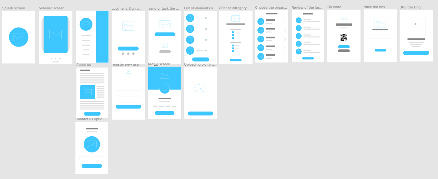
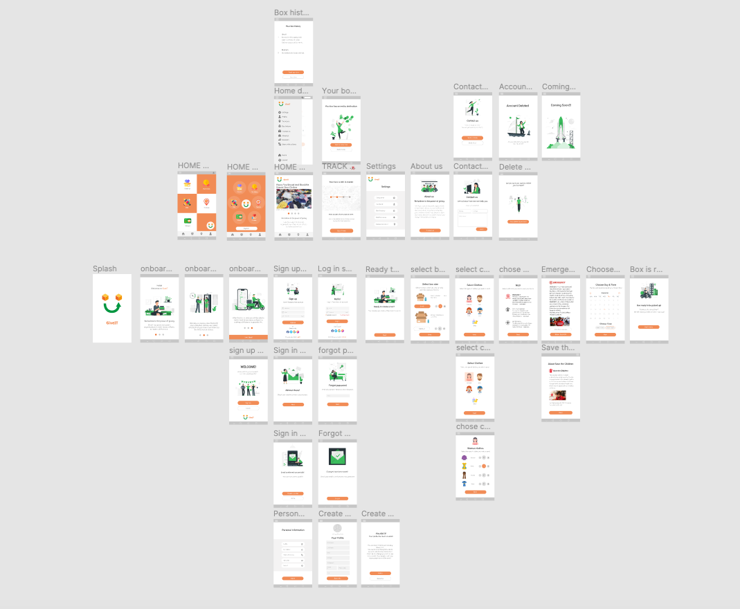
Wireframes
Low Fidelity wireframe
The next step in my process is designing digital lo-fi wireframes. This helps me set a more clear vision before designing the high fidelity screens.
Using Figma I added some details, an on board screens, a registration screen, a profile screen and about us and contact us screens.
When I designed these I focused on a simple layout, that immediately told our user what the app is about. I paid particular attention to make the app as easy to use as possible for our users.
Wireframes
High Fidelity wireframes
At this point I knew what kind of layout and design I wanted for the app because I wanted to stay true to our target user, creating a simple and effective app, easy to use and aesthetically pleasing.
The hi-fi wireframe helped me focus on the core of the product, and helped me investigate multiple directions reinforcing the views of the chosen steps, design, and usability.
The hi-fi wireframe helped me focus on the core of the product, and helped me investigate multiple directions reinforcing the views of the chosen steps, design, and usability.

UI Design
While we were designing the hi-fi wireframe, after deciding it was going to be a native android app, we decided also the visual style to use for the app. We wanted something fresh, and related to the the core of the product, something cheerful and not boring to use, aesthetic pleasing, with a simple and minimalist layout.
Our process was:
Our process was:
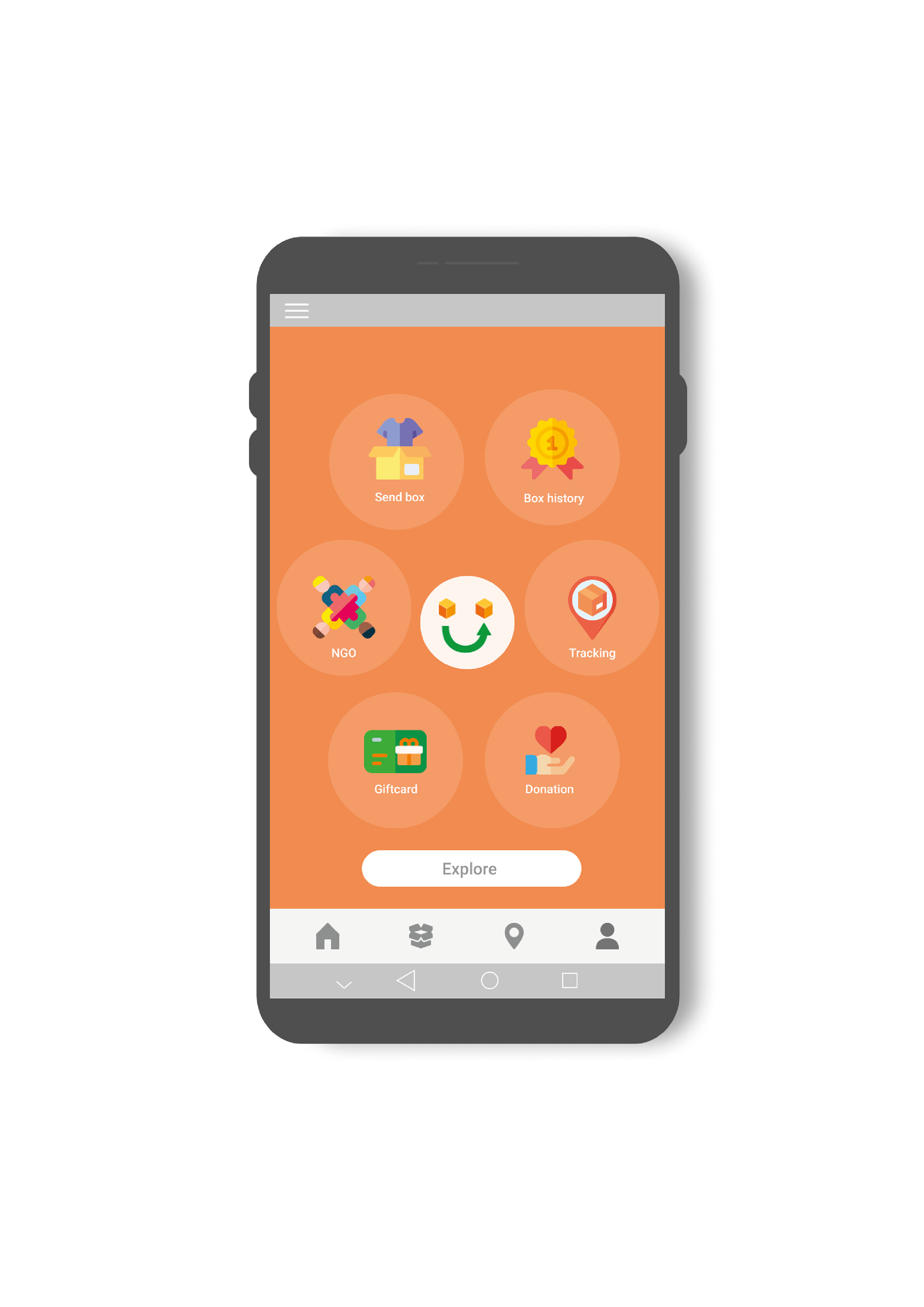
_we decided the logo and the name;
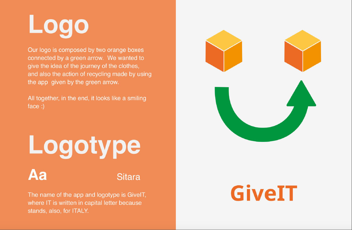
_we use the colors of the logo - orange and green - as our primary colors for the app and we added some shades of grey for the backgrounds and buttons.
_we chose Roboto as the font;
_we changed the layout and the style a little bit, making the buttons more rounded and designing more screens (on board screens, burger menu, coming soon screen);
_we added the illustrations and the icons.

Prototyping
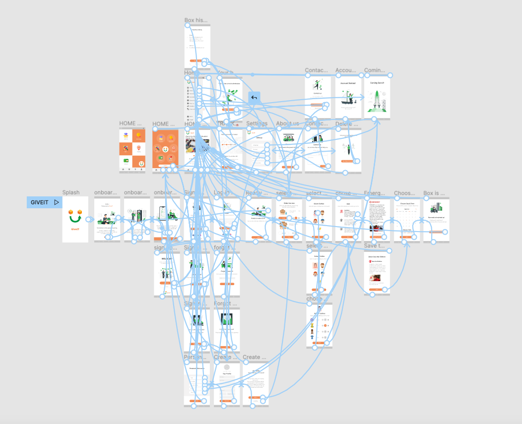
After designing the high fidelity screens we created a prototype. Prototyping in Figma was crucial to understand the navigation through the different screens. By making this interactive we were able to refine the navigation and user flows.
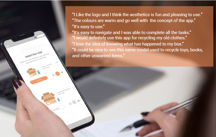
User Testing
Before launching the product, I used the prototype to conduct remote user testing with Lookback in order to reveal possible usability problems. We recruited users that match the user persona we create. Results from the session were: they didn't have any problems to understand how to complete it; they didn't find difficult to navigate through the app.
User testing was really helpful to improve our product, the process was very insightful and the users gave us ideas also for the future steps of the app.
CONCLUSIONS
What I learned so far is that people struggle with the concept of recycling clothes because there is no information about the process, because there are no recycle bin near their houses and because they don't have time to take their old clothes to charity shops or to the associations. Also getting rid of the clothes is on one hand a boring process that could take a while because of the feelings towards a specific garment, for example, or because it simply takes a lot of time and energy but on the other hand it could be a relief, because with giving away some stuff you can help people but also feel lightened because you're making room in your closet.
The biggest risk of this project was to create a product not easy to use, useless, or that people couldn't understand what we were trying to do.
The biggest risk of this project was to create a product not easy to use, useless, or that people couldn't understand what we were trying to do.
We were able to validate our assumptions, especially through the user testing. User testing was the most one of the most importante steps, because gave us feedback that can be use to improve our product and prioritize our next set of features.